DESIGN
Gin List


Safeguarding Matters - NHS


Salisbury Ale

Paper Wreath


New Day Pictures


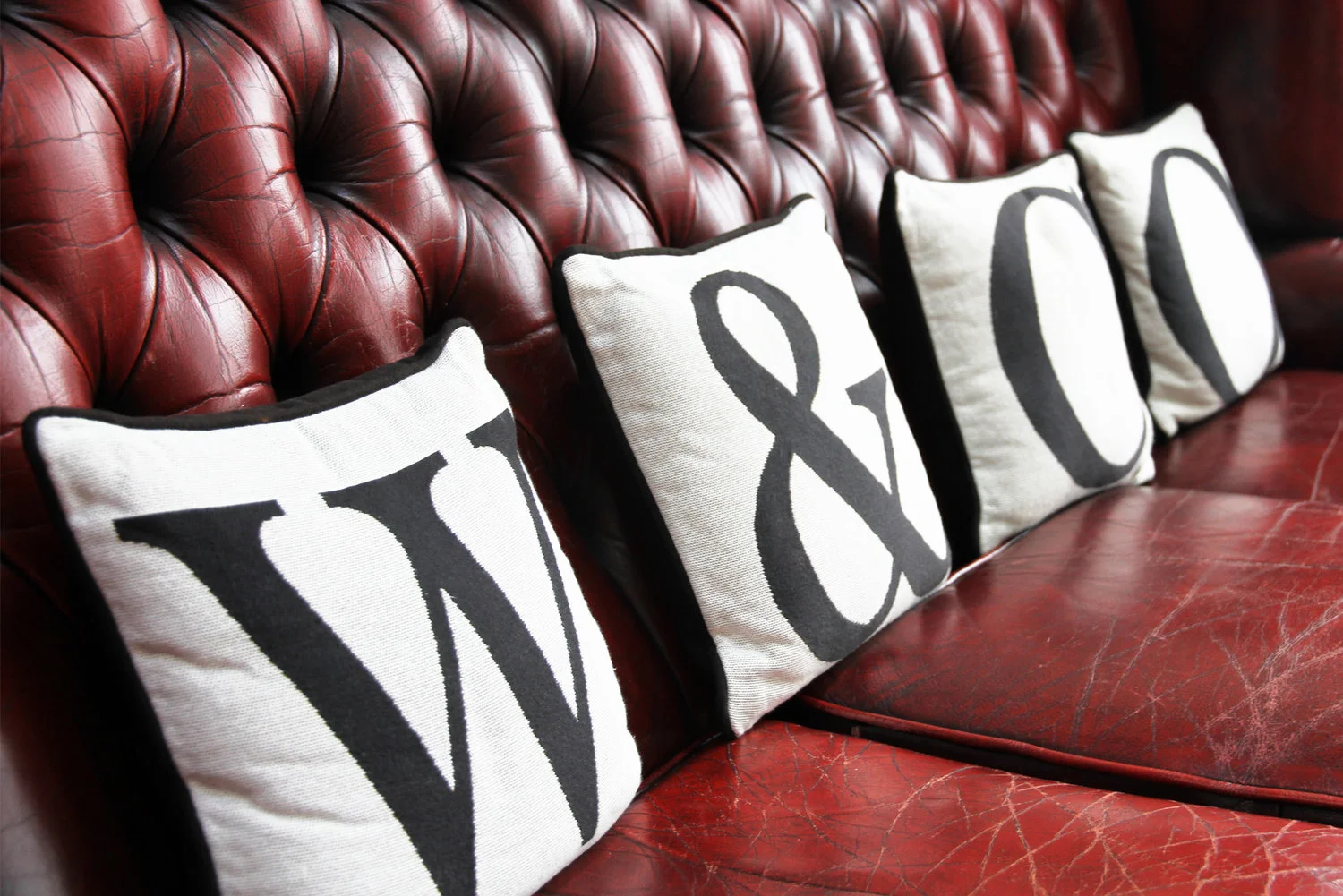
W&Co Hair


Bit'a Chutney


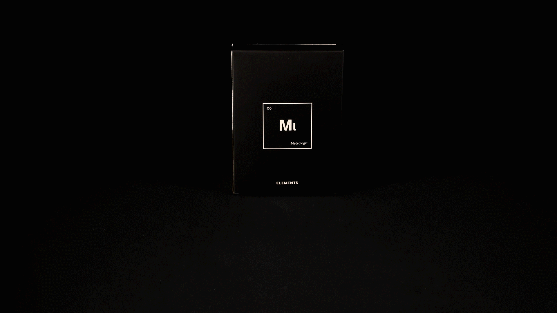
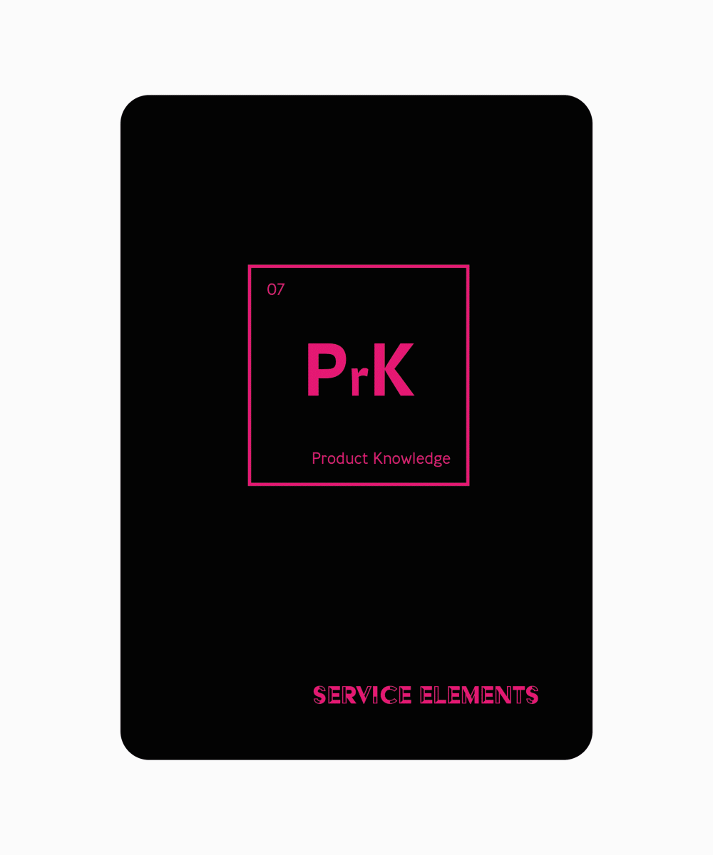
Metrologic Training


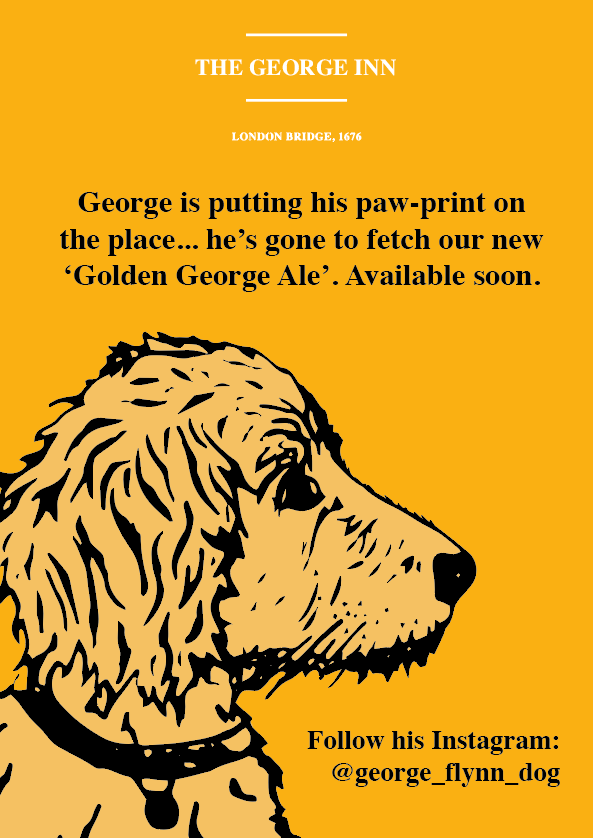
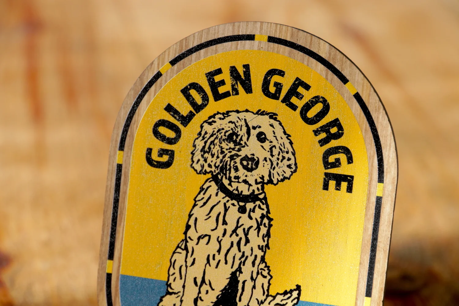
Golden George Ale


Never Liked It Anyway


Bell Inn Menu


Essex Students Union

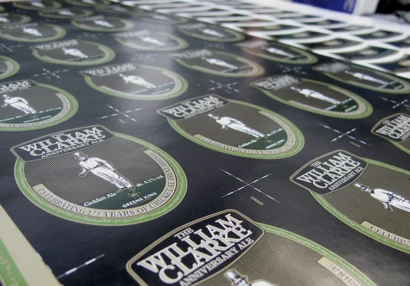
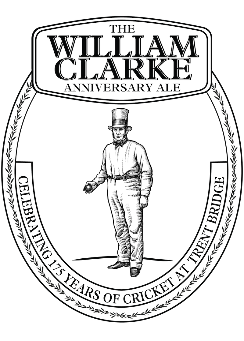
William Clarke Anniversary Ale


Assorted Models


Lendall Cellars


